Welcome to the official SQ Magazine resource hub.
Whether you are a partner, journalist, or creator, these guidelines ensure our data-driven work is represented with clarity, accuracy, and integrity.
Design Principles
- Clarity Before Ornament: Design exists to serve information. We prioritize readability, hierarchy, and structure so that complex technology, cybersecurity, and financial topics are easy to understand.
- Precision and Consistency: Our visual system reflects the same rigor as our reporting. Consistent use of typography, color, and layout reinforces accuracy, trust, and brand recognition across platforms.
- Modern and Purpose-Driven: SQ Magazine embraces a contemporary, minimal aesthetic. Every element has a function, supporting clarity, usability, and performance in fast-moving digital environments.
Brand Name Usage
SQ Magazine is written as two separate words. “SQ” is always fully capitalized, and “Magazine” is capitalized with an uppercase M. Use this exact capitalization and spacing in all articles, press materials, and branded assets.
SQ Magazine
Correct
SQMagazine
Incorrect
Sq Magazine
Incorrect
sqmagazine
Incorrect
Logos and Assets
The SQ Magazine logo is a core part of our visual identity and should be used consistently across all platforms. To preserve brand integrity, only the approved logo assets provided below should be used. These files are optimized for both digital and print applications. For custom formats, sizing, or special use cases, please contact our team.
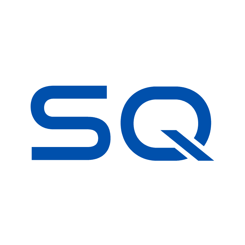
SQ Magazine on Transparent Background
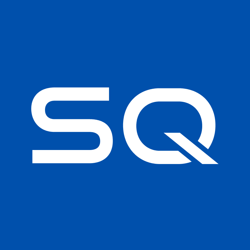
SQ Magazine Logo on Blue Background
SQ Magazine Logo on Black Background
SQ Magazine Emblem
The SQ Magazine emblem reflects our brand’s identity, standing for clarity, credibility, and trust.


Color Palette
Our palette pairs confident Tech Blue with energetic Sunny Yellow, delivering a high-contrast, modern, tech-driven look.
Primary Color: Electric Blue

- Hex: #2563EB
- Usage: Buttons, primary branding elements, active states.
Secondary Color: Yellow

- Hex: #fcfc1c
- Usage: Highlights and secondary actions.
Typography
We use a specific pairing of fonts to balance modern “tech” aesthetics with high readability.
Headings: Roboto Serif
- Style: Modern Geometric Serif.
- Usage: Page titles and promotional text.
- Weight: Bold (700), Medium (500).
Body Copy: Inter
- Style: Modern Humanist Sans-Serif.
- Usage: Articles, long-form text, UI elements.
Weight: Regular (400), Semi-Bold (600).
These guidelines ensure SQ Magazine is presented clearly and consistently across all platforms. For any special use cases or questions, our team is always happy to assist.


